Bill Pay
Redesigning a Faster, Smarter B2B Payment Experience
Project Duration
6 weeks
Role
Senior Product Designer (end-to-end UX)
Tools
Figma, FigJam, Jira, Monday.com
The Context
BillPay is a B2B fintech product helping businesses manage and pay invoices across vendors, currencies, and markets. But the core payment workflow had a major friction point: users had to manually cross-check invoice data multiple times while making a payment. Every transaction felt like a mini-audit, slowing users down and increasing errors.
This case study breaks down how I redesigned BillPay’s invoice-to-payment flow using UX for Fintech App, competitive insights, and a simplified architecture that reduced cognitive load while improving accuracy.
STEP 01
The Problem
"During payments, users constantly switched between the invoice file and the input fields".
This led to:
Enter all fields manually
Repeated back-and-forth checks
Drop-offs at the "verify details" stage
Manual errors
A slow, mentally exhausting experience
For a product that handles payments across currencies, beneficiaries, and compliance fields, the friction multiplied quickly. This was not scalable for SMBs handling dozens of invoices weekly.
The Challenge
How do we reduce friction without oversimplifying financial accuracy?
STEP 02
Research & Insights
I ran short user interviews with accountants, finance teams, and operational staff who manage high invoice volumes. They don't mind this AI flow, as long as each step feels purposeful. Accuracy was non-negotiable.
💡 User Persona included at the end
Key Patterns:
Manual entry was the biggest blocker
Users wanted automated extraction, not manual typing.
Financial data needs clarity, not clutter
When everything sits on one screen, accuracy becomes harder, not easier.
Stepwise confirmation improves trust
Users are comfortable approving payments when information is chunked.
Competitive Analysis
I analyzed Melio and others. Melio's strength was also its weakness: everything on one screen overwhelmed users.
Feature
BillPay (Old)
Melio
BillPay (New)
Manual invoice entry
Yes
No (OCR support)
No (AI extraction)
Multi-currency clarity
Medium
High
High
Steps in flow
7+
4
Beneficiary validation
Manual
Semi
AI-based match
Screen complexity
High
Medium
Low & guided
3-step guided flow
Extended Analysis
Feature / Parameter
BillPay (Old)
Melio
Wise Business
Payoneer
BillPay (New)
Invoice Data Capture
Manual entry
OCR supported
Limited OCR
No OCR
AI-based extraction
Screen Layout
Overloaded single screen
Single screen
Multi-step
Multi-step
Multi-step guided flow
Beneficiary Management
Manual
Semi-auto
Auto-save
Auto-save
Smart AI-based matching
FX Rate Transparency
Moderate
Moderate
High
Medium
Real-time FX with upfront fees
Error Handling
Post-submit
Inline
Inline
Basic
Inline validation + mismatch flags
Bulk Payments
No
Limited
Yes
Yes
No (future roadmap)
Feature / Parameter
BillPay (Old)
Melio
Wise Business
Payoneer
BillPay (New)
Learning Curve
Steep
Minimal
Medium
Medium
Minimal
Ideal User Type
Existing SMEs
US SMEs
Global SMBs
Freelancers + SMBs
SMBs making cross-border payments
Time to Complete Payment
6–7 minutes
3–4 minutes
4–6 minutes
4–5 minutes
2–3 minutes
Strengths
Flexible but manual
Fast & simple
Great FX clarity
Easy global payouts
Fast, accurate, clear
Weaknesses
Too many fields
Slightly cluttered UI
Steeper workflow
Limited OCR
None for this scope
Key Takeaways
✓
AI-assisted data entry is no longer a "nice-to-have."
✓
Payment apps must show only necessary data, only when needed.
STEP 03
Design Process (End-to-End)
Phase A
Discovery & UX Audit


We mapped the existing flow:
1
Too many fields
2
No progression
3
Unclear hierarchy
4
Heavy memory load
Phase B
Brainstorming Map
Core Problem
Reduce Manual
Effort
AI/Automation
OCR extraction
Auto-fill fields
Smart matching
User Flow
Multi-step
Progressive disclosure
Clear navigation
Validation
Inline errors
Real-time check
Mismatch flags
Data Display
Minimal fields
Collapsible sections
Visual hierarchy
💡 Invoice Upload
✓ Prefill Data
🤖 AI Assistant
💻 Web First
We ideated around:
1
AI-assisted data extraction
2
Splitting tasks into guided parts
3
Inline validation
Phase C
User Flow Diagram

Phase D
Wireframes → High-Fidelity
From low-fi to pixel-perfect screens:
🧠
Minimal cognitive load
📊
Visual hierarchy
📝
Consistent terms
💱
Readable FX rates
STEP 04
Design Strategy
We defined a simple north star:
"Let the system do the work, not the user."
To achieve this, the redesign focused on three pillars:
1
AI-Assisted Invoice Upload
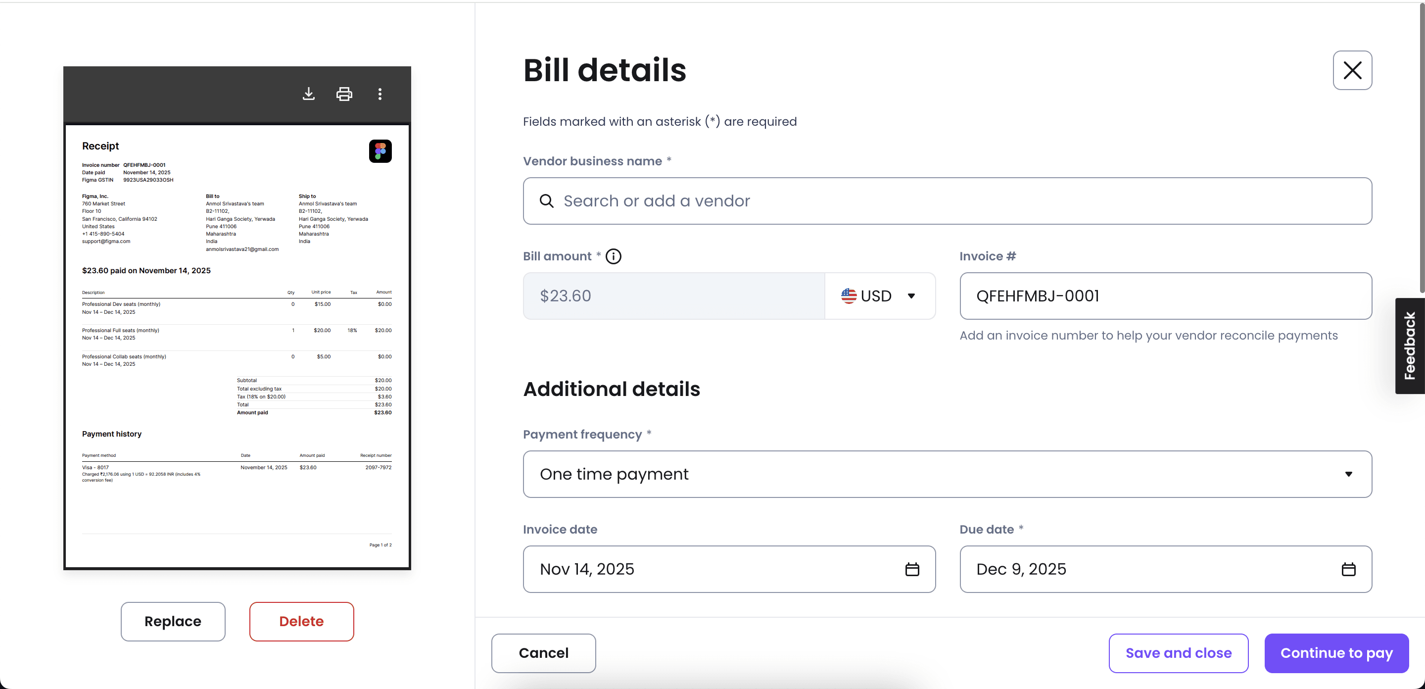
Users now start by simply uploading the invoice, instead of typing field-by-field.
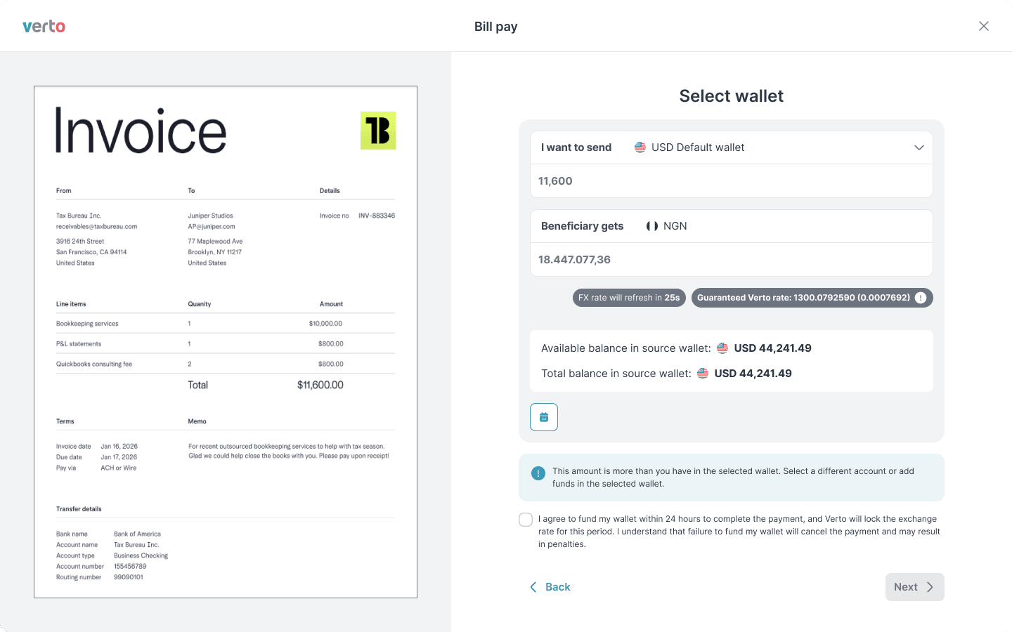
The system fetches details (amount, date, currency, beneficiary)
Extracted values appear as editable prefilled fields
Mismatches are flagged instantly
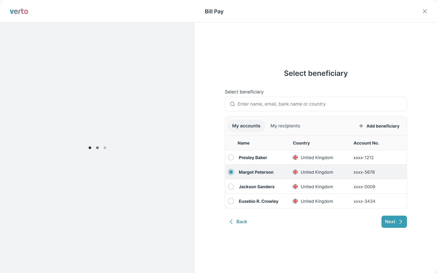
2
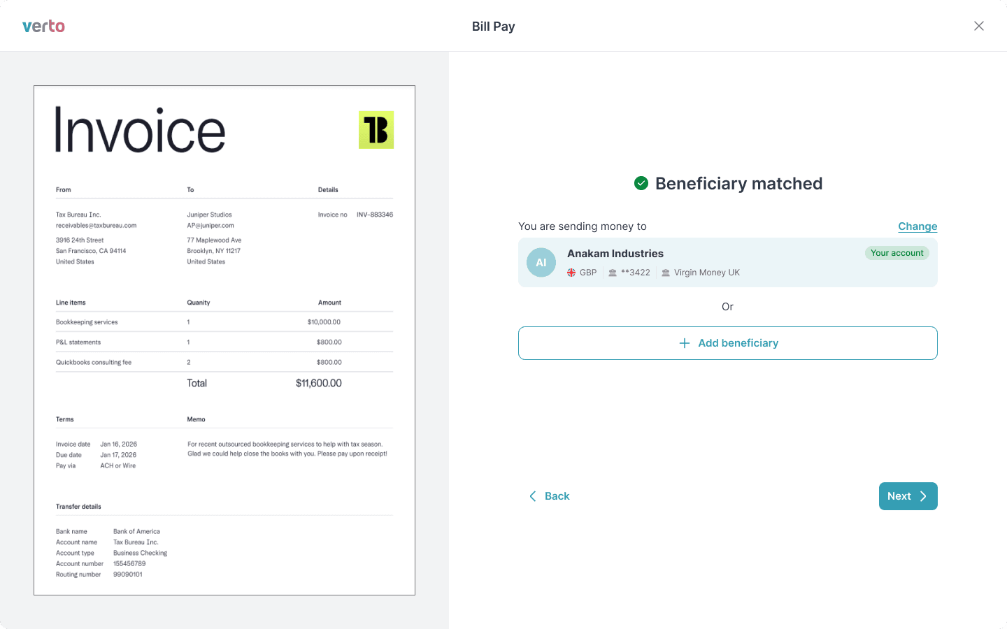
Smart Beneficiary Matching
The system checks the invoice data against saved beneficiaries.
If a match is found →
prefilled
.
If not → the user receives a simple prompt to add one.
3
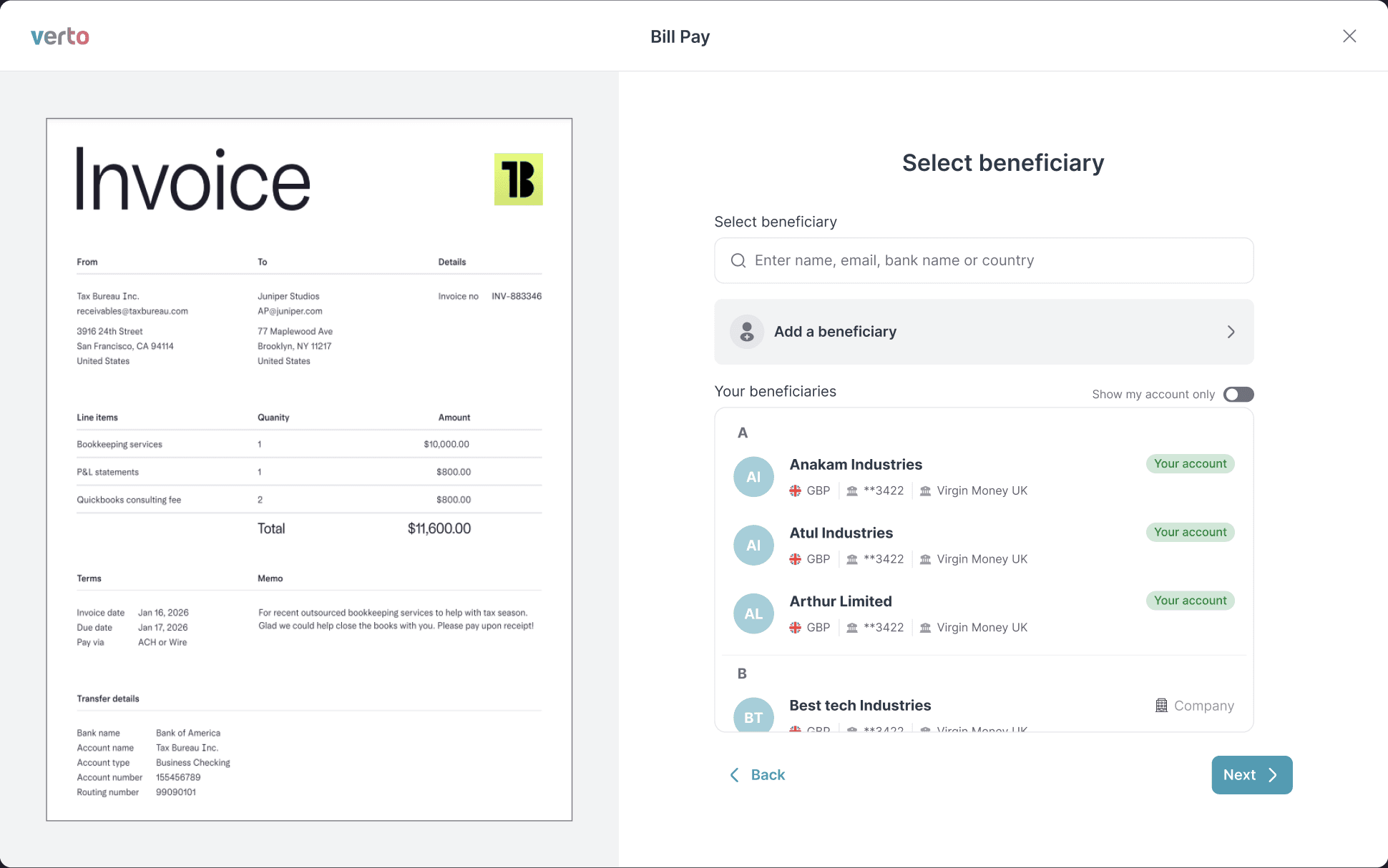
A Clean, 3-Step Flow
Instead of one overloaded screen, we broke the experience into:
Step 1
Invoice Upload
Step 2
Review Prefilled Details
Step 3
Confirm FX Rate & Pay
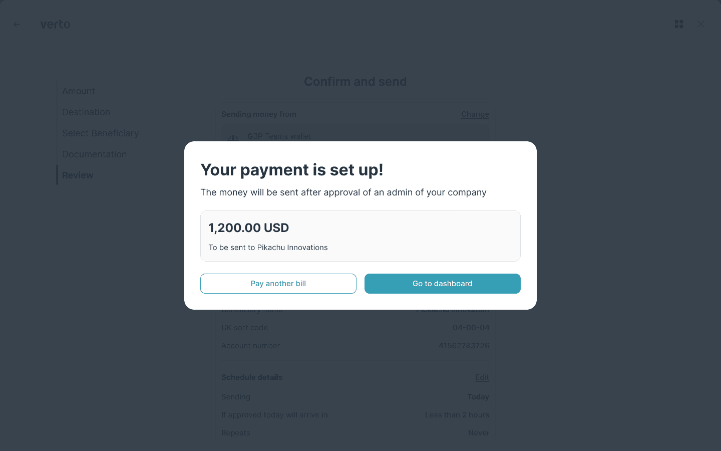
This structure cut down confusion, improved scannability, and reduced decision paralysis.
Before & After Comparison
Visual transformation of the payment flow
💻
Web Experience
❌ Before

✓ After
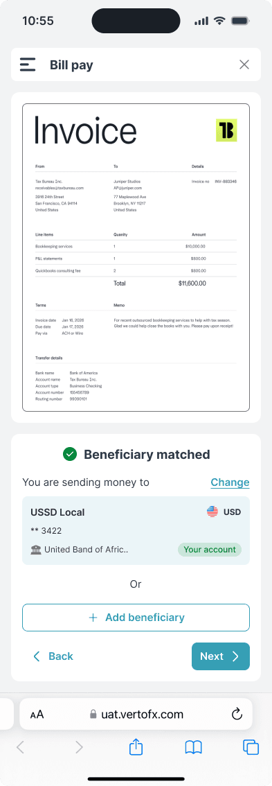
📱
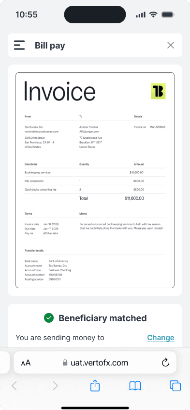
Mobile Experience
✓ All new experience
The Redesign
The New Experience: Simple, Guided & Accurate
Web Interface


The Redesign
The New Experience: Simple, Guided & Accurate
Mobile interface


STEP 05
Outcome: Faster, Cleaner Experience
After launching:
Quantitative Results
40% reduction
in clicks & field interactions
32% fewer
data-entry errors
Higher completion
for multi-currency payments
Drop in abandonment
payment abandoned cases
Qualitative Feedback
Users appreciated:
"Finally, no more jumping between tabs."
"Prefilled data is a lifesaver."
"The flow feels effortless."
Transformed into a guided, AI-powered workflow that users trust.
Impact Summary
By focusing on reducing effort and increasing accuracy, we created a payment experience that's not just faster—it's fundamentally better.
Open to senior design roles, FinTech projects, design system work, and creative collaborations. Let's talk.