Verto Pay by Link (PBL)
Simplifying B2B Payment Collection & Eliminating Manual Tracking
Project Duration
5 monthhs
Role
Senior Product Designer (end-to-end UX)
Tools
Figma, FigJam, Jira, Monday.com
The Context
In B2B transactions, collecting payments is often manual and fragmented. Businesses frequently follow up via calls, emails, or spreadsheets just to track who has paid and who hasn’t.
Verto already offered invoice-based BillPay, but there was a growing need for a simpler, faster way to request payments, especially for ad-hoc collections, recurring vendor requests, or international payees.
The goal was to build a Pay by Link (PBL) system that enabled businesses to generate and send secure payment links, while removing manual tracking and follow-up friction.
STEP 01
The Problem
From a business perspective, two critical issues surfaced:
For Business
Manual tracking of payment status
Repeated follow-ups
Re-entering same payment data
No centralized visibility
For Payees
Friction in sharing bank details
No structured payment interface
Limited deadline clarity
The system lacked automation, transparency, and repeatability.
STEP 02
Research & Insights
We conducted secondary research across global payment leaders to understand best practices in payment request systems.
💡 User Persona included at the end
Reference Products
PayPal Payment Links
Payoneer Payments
Wise Business
Research Area
PayPal Payment Links
Payoneer Payments
Wise Business
Insight Applied to Verto
Link Creation
Simple amount-based link
Invoice-style request
Wallet-based request
Streamlined quick link creation with structured inputs
Tracking
Basic activity log
Limited status visibility
Dashboard overview
Built status-first table view with clear filters
Status Clarity
Paid / Unpaid
Payment history
Transaction states
Added granular states: Pending, Completed, Expired, Cancelled
Recurring Use
Manual recreation
Re-enter details
Partial duplication
Introduced Copy Payment for 1-click duplication
Payee
Experience
Hosted checkout
Payoneer account flow
Bank transfer-focused
Designed frictionless card checkout (no account needed)
Admin Control
Limited controls
Transaction-based
Wallet-level control
Enabled resend, cancel, deactivate from dashboard
Some Insights We Noticed:
Beyond features, research highlighted that:
Businesses value visibility more than automation alone
Recurring payments need duplication, not recreation
Clear status tags reduce follow-up communication
Payee flow must feel secure and frictionless
Key Takeaways
✓
Visibility reduces follow-ups: Businesses don’t just need payment links, they need real-time status clarity to avoid manual chasing.
✓
Status clarity builds trust: Clear states (Pending, Completed, Expired, Cancelled) reduce ambiguity and operational confusion.
✓
Duplication beats recreation: Recurring payments are common in B2B. Copying an existing request is far more efficient than rebuilding it.
✓
Admins need action-ready dashboards: Finance users prioritize control tools (resend, cancel, deactivate) directly within the table view.
✓
Payee flow must be frictionless: No account creation, no unnecessary steps, a simple card checkout increases completion rates.
STEP 03
Design Process (End-to-End)
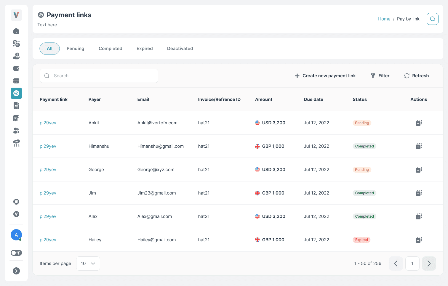
1. Centralized Dashboard
Introduced a table-first layout for finance users:
Clear payment rows
High-density visibility
Action-oriented design
2. Status Filters (Top-Level Controls)
Quick segregation by:
Pending
Completed
Cancelled
Expired
Deactivated
Reduced search time and improved operational clarity.
3. Recurring Payment (Efficiency Feature)
Recurring payments were common in B2B sector.
We added:
One-click duplication
Auto-filled payee, amount, currency
Editable deadline
Minimized repetitive manual input.

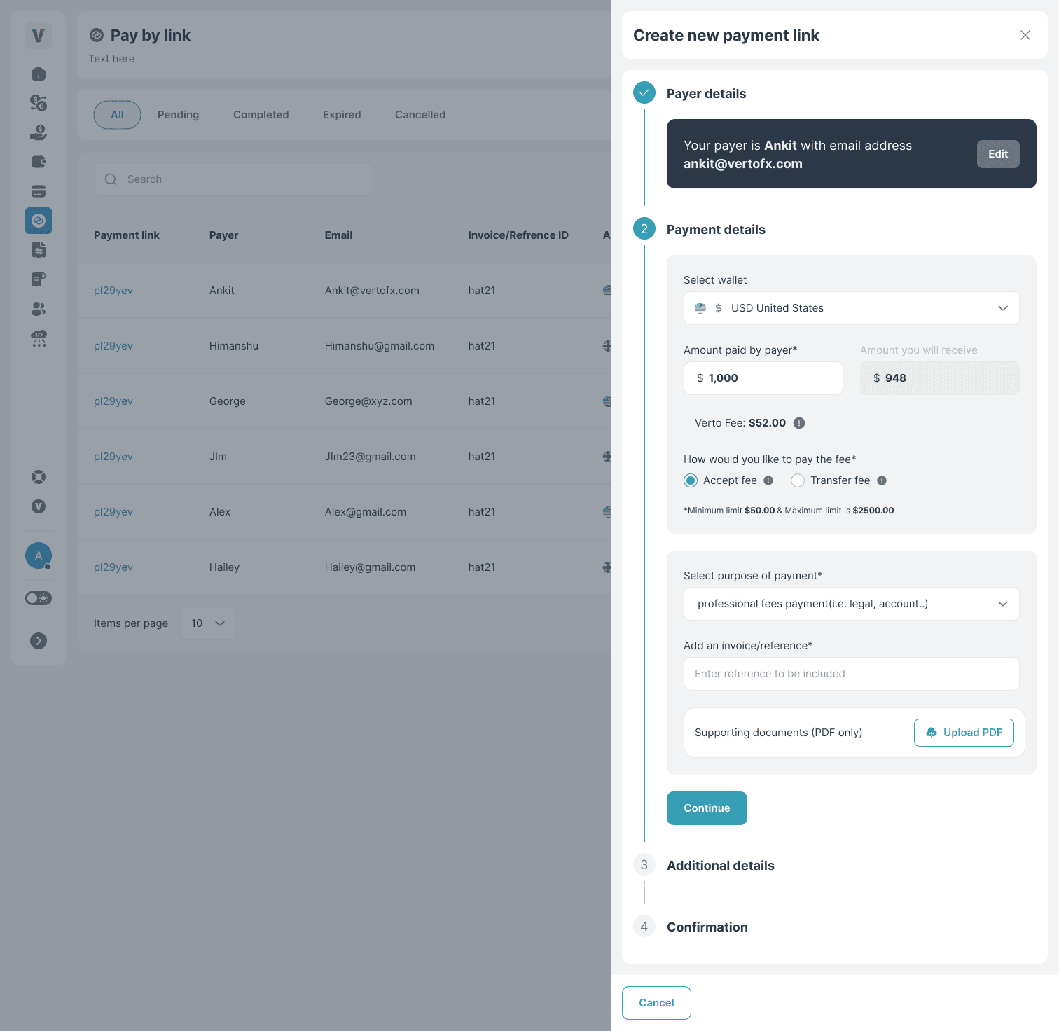
4. Simplified Link Creation
Admins can:
Add payee email
Set amount & currency
Define deadline
Generate secure link instantly

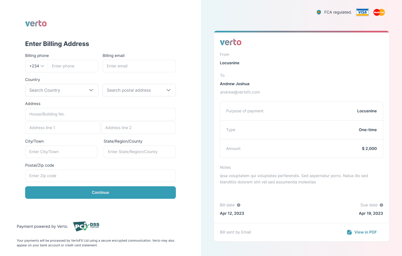
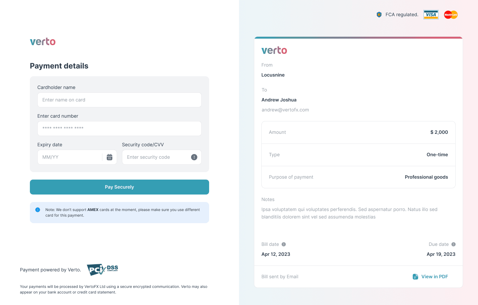
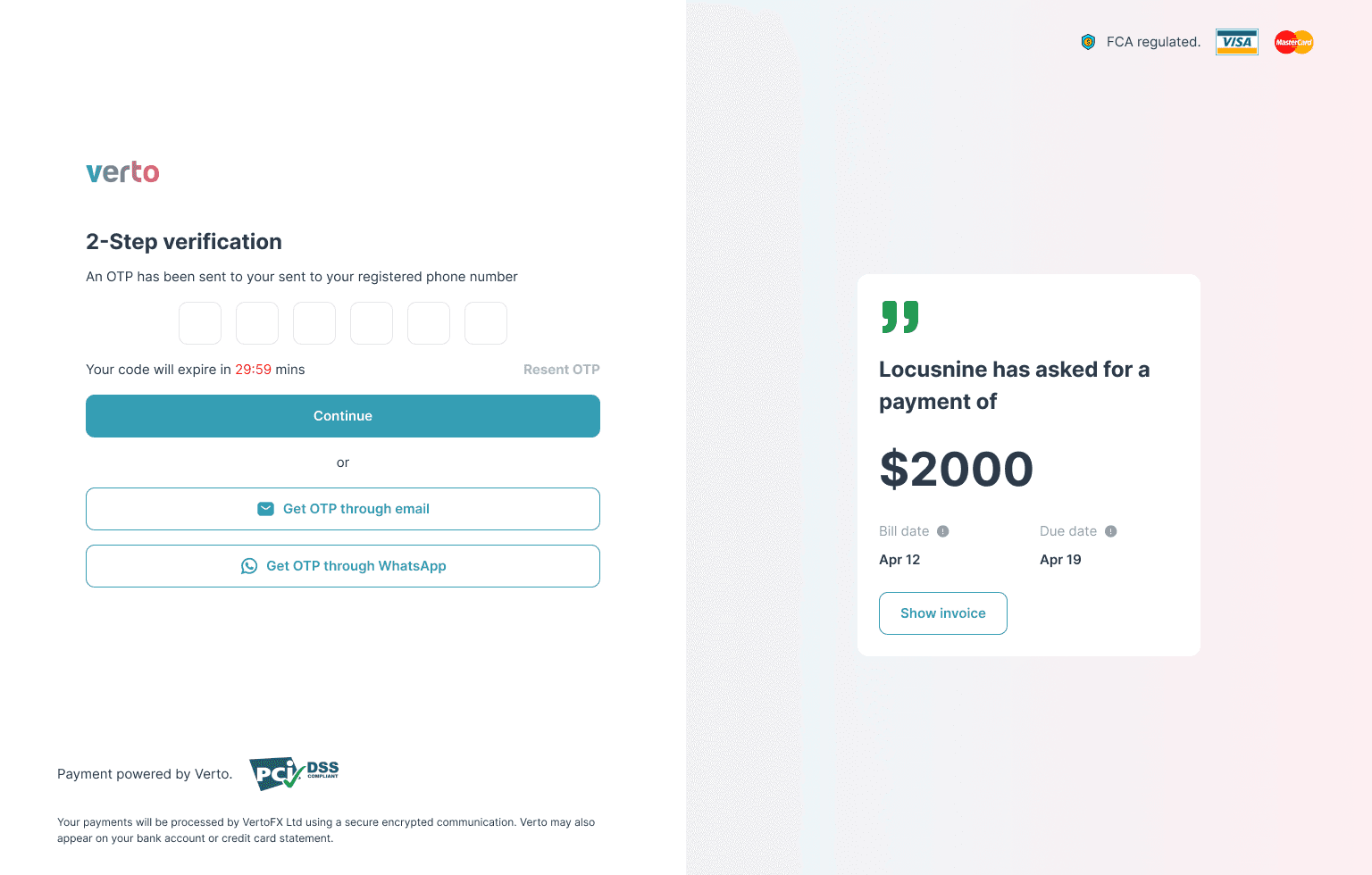
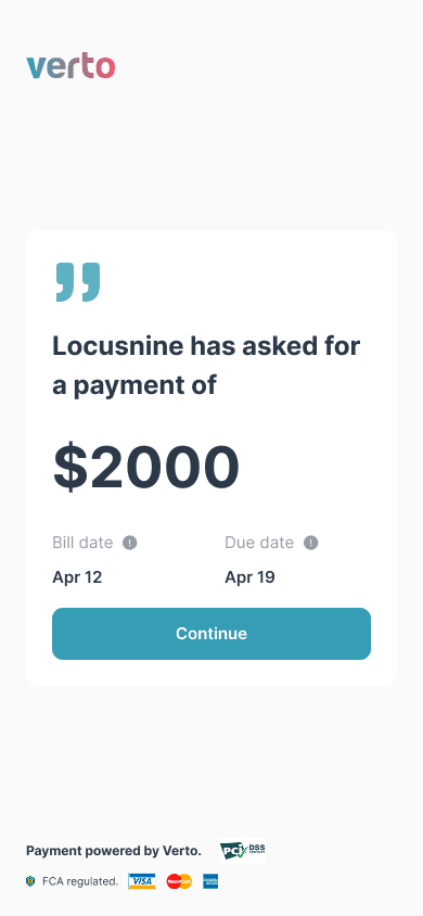
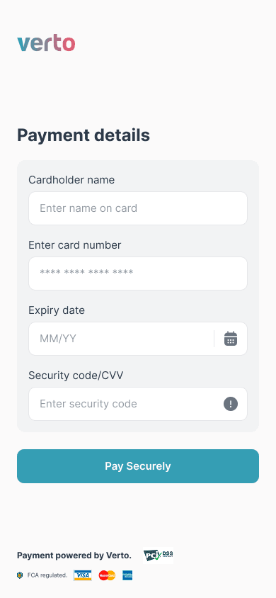
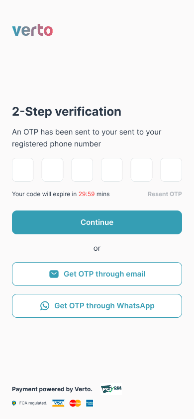
5. Payee Experience (Mobile-First)
Open secure hosted page
Enter debit/credit card details
Complete payment in minutes
No account creation required

STEP 04
Design Strategy
Dashboard-first control
The payment lifecycle was centered around a structured table view. Instead of burying information in detail pages, all key states, amounts, currencies, and deadlines were visible at a glance, allowing finance teams to operate quickly.
Action-driven interface
Every payment row included contextual actions like resend, cancel, deactivate, and copy. This reduced dependency on support teams and turned the dashboard into an operational control center rather than a passive tracker.
Repeat-friendly workflows
Since recurring payment requests were common, we designed duplication as a core feature. The “Copy Payment” action minimized repetitive data entry while preserving accuracy.
Frictionless payee experience
The hosted payment page was intentionally minimal, with no account creation and no unnecessary steps. A simple, secure card checkout flow improved completion rates and reduced drop-offs.
"Let the system do the work, not the user."
Design flow
Visual transformation of the flow
Admin end: Link creation

Client/Payee end


Client/Payee end - Mobile


STEP 05
Outcome: Faster Payments, Less Manual Checks
After launching:
Quantitative Results
80% reduction
Reduction in manual follow-ups due to clear payment status tracking
Higher completion
Faster collection cycles through direct card-based payments
Drop in abandonment
Increased repeat usage driven by the copy-payment feature
Easy handling
Lower operational overhead for finance teams
Qualitative Feedback
Users appreciated:
“Tracking payments became much easier compared to spreadsheets.”
“Resending or duplicating a link saves us a lot of time.”
“Resending or duplicating a link saves us a lot of time.”
Open to senior design roles, FinTech projects, design system work, and creative collaborations. Let's talk.